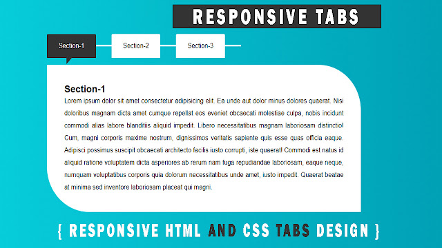
Hello readers, today we will read in this blog how to create Responsive Tabs with the help of HTML and CSS. This tab is made without the help of JavaScript and jQuery. Which you will know to create this tab with the help of html and CSS.
Tab is used in the website, by making which we easily avoid the browser space of our website from being too long. A button has been made above this tab, on clicking on which the description page related to that button appears below, which we use to attract our website, you must have seen the tab in many websites, which is either oh bootstrap is made with the help of JavaScript or jQuery. Which you will learn to make tabs in this blog from html and CSS.
How to Make Tabs Design Only HTML and CSS
Now we know about the code of this tab which we have designed Tabs Design.
We have taken a div inside the body tag whose class name is written as class="wrapper"; inside this class div a <h1> tag is taken and inside this heading tag the heading of the tab is written.
Then under <h1> tag we have taken<ul> tag, we call <ul> tag as Unordered List, inside this Unordered List we have taken class attribute whose class name is written as class="tab-wrap".
Inside Unordered List (<ul> tag) we have taken three li <li> tag we call List Item, one input tag is taken inside the list item, we mostly use the input tag inside the form but here we have input tag is written inside a <li> tag. Under the <li> tag, an attribute named type is taken, which is named type="radio". And under this input tag, the attribute named id is taken, which is named as id="tab-1" and under this the name attribute is written as name="tab", after that the attribute of the checked name is given as input. has been kept checked.
After this, a label tag has been taken below the input tag, inside which an attribute named for has been taken, whose name we have given for="tab-1" to use the for attribute with the input tag id.
And under this label tag we have taken the div whose class name is class="tab-content" inside this div we have used to see the description of the box which is taken inside a <h2> tag and p tag for the paragraph.
If you are having trouble understanding this blog or want to get more information about it, then you can click on the video below and see the complete code and tabs design from it.
<!DOCTYPE html>
<html lang="en">
<head>
    <meta charset="UTF-8">
    <meta http-equiv="X-UA-Compatible" content="IE=edge">
    <meta name="viewport" content="width=device-width, initial-scale=1.0">
    <title>HTML CSS TAB</title>
    <link rel="stylesheet" href="style.css">
</head>

<body>
    <div class="wrappper">
        <h1>HTML AND CSS TAB</h1>
        <ul class="tab-wrap">
            <li>
                <input type="radio" id="tab-1" name="tab" checked>
                <label for="tab-1">Section-1</label>
                <div class="tab-content">
                    <h2>Section-1</h2>
                    <p>Lorem ipsum dolor sit amet consectetur adipisicing elit. Ea unde aut dolor minus dolores quaerat. Nisi doloribus magnam dicta amet cumque repellat eos eveniet obcaecati molestiae culpa, nobis incidunt commodi alias labore blanditiis
                        aliquid impedit. Libero necessitatibus magnam laboriosam distinctio! Cum, magni corporis maxime nostrum, dignissimos veritatis sapiente quis esse quas officia eaque. Adipisci possimus suscipit obcaecati architecto facilis iusto
                        corrupti, iste quaerat! Commodi est natus id aliquid ratione voluptatem dicta asperiores ab rerum nam fuga repudiandae laboriosam, eaque neque, numquam voluptatibus corporis quia dolorum necessitatibus unde amet, iusto impedit.
                        Quaerat beatae at minima sed inventore laboriosam placeat qui magni.
                    </p>
                </div>
            </li>
            <li>
                <input type="radio" id="tab-2" name="tab">
                <label for="tab-2">Section-2</label>
                <div class="tab-content">
                    <h2>Section-2</h2>
                    <p>Lorem ipsum dolor sit amet, consectetur adipisicing elit. Possimus nobis voluptatibus officiis commodi aliquam id deleniti exercitationem consequuntur minima nam tempore molestias, nostrum quibusdam ipsam dolore magni, provident aut
                        beatae nulla error tenetur esse velit! Molestiae dignissimos voluptatibus praesentium qui iste. Itaque, magni tempore. Nihil exercitationem aspernatur harum quam similique.
                    </p>
                </div>
            </li>
            <li>
                <input type="radio" id="tab-3" name="tab">
                <label for="tab-3">Section-3</label>
                <div class="tab-content">
                    <h2>Section-3</h2>
                    <p>Lorem, ipsum dolor sit amet consectetur adipisicing elit. Officia nemo ipsum ad nulla mollitia impedit, soluta dolorum, nesciunt quod id animi reiciendis magni! Eligendi illum voluptate a, omnis quibusdam consequuntur.</p>
                </div>

            </li>
        </ul>
    </div>
</body>

</html>
CSS CODE FILE :
* {
  margin: 0;
  padding: 0;
  box-sizing: border-box;
}

body {
  font-family: arial, sans-serif;
  background: linear-gradient(to right, #07d2df, #009eb3);
}

h1 {
  font-size: 2em;
  font-weight: bold;
  text-align: center;
  padding: 0;
  margin: 30px 0;
  color: #fff;
}

.tab-wrap {
  width: 60%;
  list-style: none;
  text-align: left;
  padding: 0;
  margin: auto;
  position: relative;
}

.tab-wrap input[type="radio"] {
  position: absolute;
  top: -9999px;
  left: -9999px;
}

.tab-wrap li {
  float: left;
  display: block;
}

.tab-wrap label {
  background: #fff;
  color: #333;
  color: inherit;
  text-decoration: none;
  display: inline-block;
  border-radius: 3px 3px 0 0;
  margin: 0 41px 0 0;
  padding: 20px 30px;
  cursor: pointer;
  position: relative;
}

.tab-wrap label::after {
  content: "";
  border: 2px solid #fff;
  position: absolute;
  right: -33%;
  top: 44%;
  width: 30%;
}

.tab-wrap .tab-content {
  background: #fff;
  width: 100%;
  border-radius: 0 110px;
  position: absolute;
  top: 75px;
  left: 0;
  padding: 45px;
  display: none;
}

.tab-wrap [id^="tab"]:checked+label {
  background: #333;
  color: #fff;
}

.tab-wrap [id^="tab"]:checked+label::before {
  content: "";
  position: absolute;
  top: 100%;
  left: 50%;
  border-top: 15px solid #333;
  border-right: 14px solid transparent;
  margin-left: -13px;
}

.tab-wrap [id^="tab"]:checked~.tab-content {
  display: block;
}

.tab-content p {
  font-size: 16px;
  line-height: 30px;
  text-align: justify;
}

@media(max-width:768px) {
  .tab-wrap {
      width: 80%;
  }
  .tab-wrap li {
      width: 100%;
      margin-bottom: 18px;
  }
  .tab-wrap label {
      padding: 15px 11px;
      width: 100%;
  }
  .tab-wrap label::after {
      display: none;
  }
  .tab-wrap .tab-content {
      top: 200px;
  }
}


Post a Comment